March 29, 2009

Will Uclick make comic books obsolete?

The short answer is no. For those of you not familiar, Uclick is a company that distributes comic strips and some news and editorial articles through mobile phones, and now they are making the leap to actual comic books. They put in each page of the book panel by panel and you view the comic one panel at a time. Their new push is to get their comics put on the iPhone with an app that is avaliable from the app store. The program is free but the comics cost 99 cents per issue, and each issue is changed a bit from the print version, with speech bubbles moved around to make it look better.

I read an unfortunately titled article on io9 that claimed that this application was going to make comic books obsolete, and i could not disagree more. Heres why.

The Uclick solution is only good if you consider a comic to be nothing more than a book with pictures. While Uclick might work for some marvel and DC comics, it will never be able to translate Watchmen's beautiful page layouts and formatting


It will never be able to translate Chris Ware's experimental panel directions and page design.


(Definitely click for a full view)

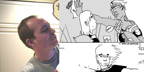
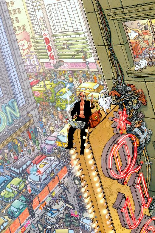
It will never be able to show the intricate detail and power of a Geoff Darrow book.
Click these images for a full view, then imagine looking at them on a cellphone screen.


All of these lead to one thing: It will never let comics grow as a medium. It changes the visual language of comics into illustrations. It makes comics into illustrated books with one picture per page. Just having word balloons and pictures in a rectangle doesn't make something a comic. As Scott Mccloud says, comics are a medium where the reader does the storytelling. The gutter, that blank space between panels, is where the story happens. It allows the reader to see what happens between a panel and another panel, without actually seeing it.

If someone throws a ball in one panel and someone else catches it in the next panel, the reader knows that in that gutter space the ball travelled through the air between the first person and the second.

The io9 article says that reading Bone on the iphone is a better experience than reading the actual book, but reading the article makes me doubt that the author had read Bone before. If you haven't read it, it's a story about a tiny bone shaped creature and two of his cousins who are driven out of their home and find a valley full of dragons and monsters and kind young girls, and then are suddenly thrust into the middle of a war. I would call it the Odyssey of comics because of the epic size, scale and powerful journey that the characters go through. I cant imagine reading this on an iPhone screen because of panels like this.


A full page shot of the lord of the locusts surrounded by a group of rat creatures as smoke rises into the night sky, on the iphone, would be the exact same size as a tiny panel where two characters talk.


There is nothing wrong with illustration or illustrated stories, but it is foolish to assume that you can take a comic and read it panel by panel and still have the same sense of pacing as reading page by page, and it is even more foolish to assume that one could replace the other.

February 4, 2009

Art Imitates Life.

Maybe it's just me, but dont artists look alot like the characters they draw? I suppose everyone (or at least me) grows up drawing themselves because it's the easiest and most avaliable reference they have. Even so, It is interesting to compare what people look like to their art. My buddies Jeremy and Tucker both look somewhat like the characters they draw, but I've chosen a few artists you might be more (or less?) familiar with. Ive tried not to chose drawings that are self portraits or at least ones that dont look exactly like the artist themself to illustrate the similarities more clearly so that you can get a better feeling for the overall character design vs. face. I encourage all of you to take a look at their sites and find pics of them around places that will give you a better idea of what im talking about.


First off my man Harvey James (who i talked about a few posts ago. Things to look at: Pronounced chin, sideburns, slightly wavy hair, big expressive eyes, and more triangular less rounded noses.


Next up is the hilarious Tony Millionaire. Creator of Maakies (Which I reccomend you read immediately.) My cousin Vonn introduced me to him when I was still in middle school and I've been laughing all the way to the bank ever since. I chose Uncle Gabby to compare him too not as an insult, but to illustrate the large ears, lined face (not nessescarily wrinkly, just very defined) large nose, eyebrows and eyes, chin, and of course, booze.


This is Corey Lewis "The Reyyy" creator of Sharknife, Peng, and other rad comics. He is a wicked talented individual with a hip hop manga mixtape of a look that blows your mind. This is sort of a wacky pic of him but it shows the swishy bangs, large eyebrows, light hair, cheeks and nose.
Reey is also from Seattle, so he gets bonus points.


Another Seattlite Brandon Graham has got a wicked kind of thang going on in his art that inspires me whenever i look at it. As well, his blog is a great resource of comics knowledge (and the main reason i started this one) as well as a great place to go look at his art. Its hard to find good pictures of him on the web, let alone find pictures that he's drawn that aren't just wicked babes with no pants on and samurai swords. Things to look at: the rounded forms in the face especially forehead, cheeks, neck, and nose. Definitely go check this one out and let me know what you think!


Becky Cloonan is a very talented lady and a fantastic storyteller. If you don't know who she is there's a pretty good chance you aren't reading this blog. Things to look out for: Dark, deep set eyes, curvy eyebrows, rounded chin and noses, slightly large cheeks and thick lips.


Paul Pope, the Comics Destroyer himself. Paul pope is the reason for this post. Paul pope is himself an incredibly interesting looking person. His characters are amazing and if you haven't heard of him or seen much of his stuff you should go check it all out. But seriously folks, all of his characters look like him, at least just a little. Things to look for: Thin eyes with just a tiny bit of (or alot of) wrinkling, slightly angry or furrowed eyebrows, super defined cheek bones and chin, curly or wavy hair, smile lines on cheeks, bulbous or rounded noses, and lots of lines around the face from expressions.

Please let me know what you think and tell me if you find other artists that you think draw similar to themselves! I used all of these images without permission from the artists websites, but they all seem pretty cool so i think i'll be fine. I hope i didnt insult them either because all of these artists are ridiculously talented and inspire me each in different ways. Night everybody.

January 24, 2009

Manga and Visual Language

Ladies and Gentlemen, let me tell ya.
Ive been thinking alot lately about comics. By lately I of course mean the past 4 years, but recently ive been jumping on that shit like never before. I feel like in the past ive disrespected manga and anime a decent bit, but let me tell ya, good manga has got it goin on in ways that alot of stuff from america can't come close too. I read Akira all the way through awhile back and man oh man is it good or what.


The line quality is pretty unmatchable and the level of detail that Otomo puts into his images is out of this world. Look at the detail just in the buildings in the background, and look at the trees and even just the grime and scratches on the playground equipment. Thats how comics are done my friend.


Whew! look how freakin' fast that page is moving! I love the iconography and visual language of manga. the "speed lines" give the impression of movement because it looks like a photograph where the camera is following the subject so that the world around the subject blurs, rather than a photograph where the subject blurs and the environment remains static. As well, the dust coming off the wheels of the motorcycles in the top panel adds to the movement because it shows you where the motorcycle has been. Its the same sort of thing Paul Pope does with light.


What Pope's style lends to it is that it combines the movement within the panel (speed lines/light trails) and a kirby-esque exaggeration of forms (warped/extreme perspective) to push the movement off the page.


He relies less on the speed lines and more on particle movement, meaning things like the blood coming off Batman's wound, the dust scraped up by his boots, the light on the neon signs as he moves by, and the spit from the dogs mouths. He also uses material spectacularly. The fabric of Batman's clothes stretches and waves perfectly and his cape waves behind him which add to the illusion of movement. All this is exaggerated and warped by Pope's super stylized linework. Keep in mind that Pope is one of the only american artists to ever have worked for Kodansha, Japans most renowned Manga publisher.
It's hard to look at quality american comics today and not see the influence manga has on western art. Since I've always had a little bit of a grudge against manga and anime (hey, my early days were spent surfing deviant art for hours at a time, its hard not to get sick of manga when every other image you see is terrible fan art) I've never really gotten a chance to explore it as its own thing. If you have any recommendations I'd love to hear them! Give me some good manga to read!